When developers talk about Lighthouse optimization, the advice often becomes predictable very quickly: remove animations, simplify the UI, drop backgrounds, and make everything more static.
that works.
But it also creates a second problem: the site may become faster while losing the visual identity that made it memorable in the first place.
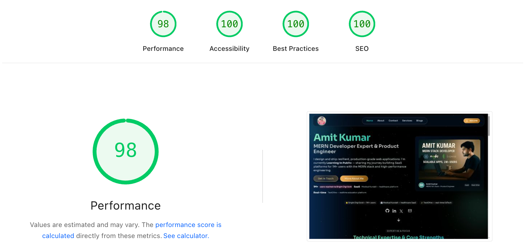
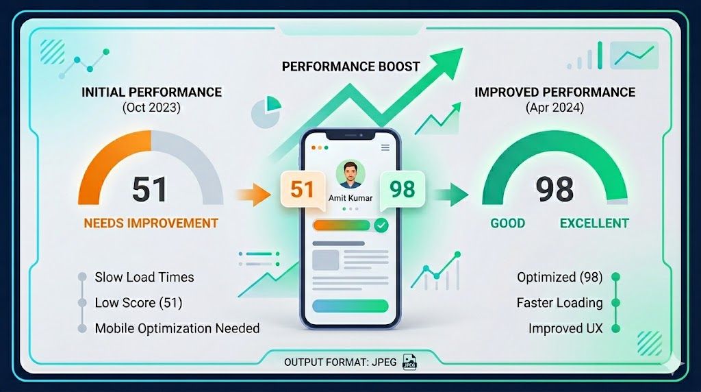
I recently went through that exact tradeoff on my own portfolio.
My mobile Lighthouse score was close, but not where I wanted it to be. The challenge was not just “make the score higher.” The real challenge was this:
- keep the motion-driven personality of the site
- keep the background treatment and overall atmosphere
- preserve the polished visual feel on mobile
- improve performance without turning the homepage into a generic static layout
This article is a practical breakdown of how I approached that problem on a Next.js websites and the specific areas that matter most when you want better mobile scores without flattening the design.
The real problem with mobile Lighthouse
Desktop performance can hide a lot of inefficiencies.
Mobile Lighthouse is far less forgiving because it combines:
- slower CPU assumptions
- slower network conditions
- tighter rendering budgets
- more visible delays in above-the-fold content
In my case, the homepage already looked polished and interactive, but Lighthouse was pointing toward a familiar cluster of issues:
- Largest Contentful Paint was not bad, but not comfortably green
- the browser was downloading some images larger than necessary for mobile
- too much JavaScript was competing with the initial render
- non-critical shared features were still joining the first load path
- decorative enhancements were being paid for too early
The key insight was that I did not need to remove the experience.
I needed to change when and how the experience was paid for.
Step 1: Fix the actual LCP asset first
Before touching animation, I looked at the content that mattered most to the first screen.
On my homepage, the hero image is a major visual anchor. If that image is oversized for mobile, Lighthouse will surface it immediately because it directly affects LCP.
The fix here was simple but high impact:
- keep using `next/image`
- preserve the visual asset
- provide a realistic `sizes` value for mobile instead of letting the browser assume a larger rendered width
That matters because an image that visually displays closer to ~320 to ~550 pixels wide should not be fetched like a desktop-scale asset when a mobile device is under pressure.
If your LCP image is visually important, optimize the request, not the design.
That means:
- serve only the dimensions the viewport needs
- use a compressed source image
- avoid stacking multiple `priority`-style requests around it
- keep the hero content stable so the image can paint quickly
This one class of fix usually gives cleaner gains than aggressively redesigning the section.
Step 2: Stop over-prioritizing images that are not LCP
A common mistake in is marking too many images as high priority.
It feels harmless because every image looks important from a design perspective.
But from the browser’s perspective, this creates competition.
If the hero image, navigation avatar, and project media are all treated like top-priority assets, you are making the network do too much too early.
On mobile, that cost becomes very obvious.
So instead of asking “is this image visually important?”
Ask:
- is this above the fold?
- is this part of the LCP candidate?
- does the user need it in the first render?
If the answer is no, it should not compete with the first paint.
This is one of the cleanest ways to improve PageSpeed without changing the interface at all.
Step 3: Defer shared layout helpers, not the personality of the page
One of the safer performance wins was in the shared layout rather than the homepage visuals.
A lot of sites ship helpful but non-essential features immediately:
- toast containers
- analytics
- speed-insights scripts
- scroll-to-top widgets
Individually, these do not always look expensive.
Together, they still add work to hydration and early JavaScript execution.
These are perfect candidates for a delayed client enhancement pattern.
In practice, that means:
- render the actual page first
- wait until the browser is idle or the first interaction window has passed
- then load the non-critical helpers
This keeps the visible experience intact while reducing pressure on the first mobile render.
Most importantly, it does not require stripping visual identity from the homepage.
Step 4: Keep animations, but make them cheaper to carry
This is where many performance conversations go wrong.
The question should not always be “should I remove motion?”
A better question is:
How much JavaScript am I paying just to enable that motion?
For animation-heavy sections, there are a few practical ways to preserve the visual feel while reducing cost:
- scope animation libraries to only the sections that need them
- prefer lazy motion features when using Framer Motion
- avoid making every shared layout component depend on the full animation runtime
- use CSS animation when the interaction is simple enough
- keep decorative effects out of the first render path when possible
The goal is not to become anti-animation. The goal is to avoid paying the full motion tax everywhere. That distinction matters a lot on mobile.
Step 5: Treat decorative backgrounds as progressive enhancement
This was the most sensitive part of the optimization because the background treatment contributes heavily to the site’s personality.
Removing it made the page technically lighter, but it also made it feel less premium.
That told me the background was not optional from a brand perspective.
So the right move was not removal.
It was progressive enhancement.
In other words:
- preserve the static atmospheric background immediately
- load heavier decorative layers after the page has stabilized
- keep motion-sensitive fallbacks for users who prefer reduced motion
This is a much healthier strategy than forcing an all-or-nothing choice between aesthetics and performance.
If a design element is core to the identity of the site, it deserves a smarter loading strategy rather than a quick deletion.
Step 6: Reduce “first load JavaScript” by moving the right things, not everything
I tested a few approaches here, and there is an important lesson:
not every kind of deferral is safe.
If you push entire sections too far out of the render lifecycle, you may improve performance metrics while creating UX issues, loading glitches, or content that appears to disappear.
That is not a real win.
What worked better was a more conservative rule:
- keep critical and expected content rendering normally
- move only clearly non-essential behavior off the critical path
- avoid clever loading strategies that make the page feel unstable
This is especially important on sites, where trust and polish matter as much as speed.
A slightly lower score is still better than a broken or inconsistent experience.
My practical Lighthouse checklist for portfolio websites
If I were improving a mobile Lighthouse score on another motion-heavy website today, this is the order I would follow:
1. Identify the LCP element
- confirm whether it is an image, heading block, or large visual card
- optimize that exact element first
- do not guess
2. Audit image priority
- reserve `priority` for the real hero asset
- remove high-priority fetching from navigation icons, project thumbnails, and below-the-fold visuals
3. Audit shared client code
- analytics
- speed insights
- third party systems like Toast, lottie etc
- scroll helpers
- UI widgets that do not matter on first paint
4. Inspect animation footprint
- reduce library scope
- prefer lazy
-loaded animation features
- replace trivial animations with CSS when possible
5. Preserve brand layers through staged rendering
- static atmosphere first
- richer decoration second
- interactivity third
6. Re-run Lighthouse after each change
- watch LCP
- watch unused JavaScript
- watch main-thread work
- avoid making multiple unrelated changes without measuring the effect
What this changed in my thinking
This process reinforced something I believe applies far beyond portfolio sites:
performance is not the opposite of design quality.
Poorly staged experiences are the problem, not visually rich experiences by themselves.
A site can be animated, atmospheric, expressive, and still perform well.
But only if you decide very intentionally:
- what must render first
- what can wait a little
- what is actually essential
- what is merely happening too early
That shift in mindset is more valuable than any individual Lighthouse trick.
Final takeaway
If your mobile Lighthouse score is close to green, do not immediately start deleting the parts of your site that make it feel special.
Start with the fundamentals:
- right-size the hero image
- remove unnecessary image priority
- defer non-essential shared client helpers
- reduce JavaScript competition in the first render
- keep visual identity, but stage it intelligently
That is how I think about performance-first design now.